Look, I try to lead a positive life with a sunny outlook. I’m a ‘glass half full (of beer)’ kinda guy. If you spend your life hating everything then it figures that in turn, life will hate you. Plus, I believe that motorcycles—all motorcycles—are a modern miracle anyone in their right mind should enjoy, no matter what aesthetics are involved. First world problems and all that.
But that said, image is still important to a lot of bikers—and in the eyes of many, you are what you ride. So if you’ve ever wanted to come across to judgy riders as a low-IQ circus clown with body odor issues, have we got some bikes for you. Below are our choices for the top 5 ugliest bikes ever made.
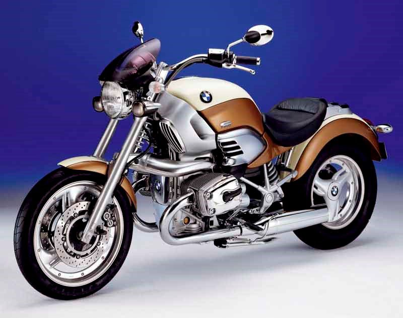
Ugliest Bikes (#5): The 1997 BMW R1200C
“Of course electric blue and coffee brown go together; just take the damn photo!’ Image via BMW.
OK, I’m gonna wear my heart on my sleeve here and tell you all that I kinda like this bike. Yes, I’m a bit of a BMW tragic at the best of times, but I think the bike has a certain eccentric charm to it.
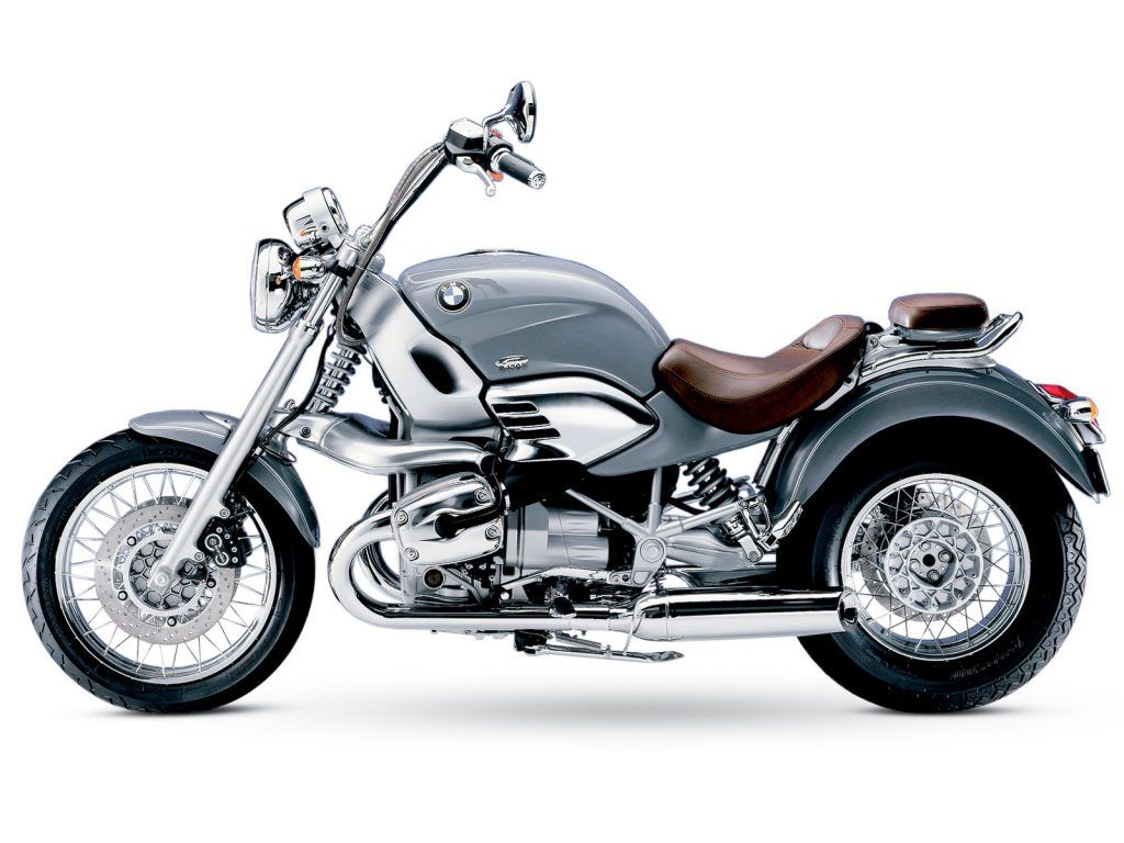
There’s no doubt in my mind that the above image makes the bike look like a nightmare of poor colour choices, bulbous lines and super dated looks—but the shot below reveals a little of what I like about the design. It has a nice kind of steampunk coolness to it, like a bike from a Japanese Anime.
I’ll admit it. I do like it. Image via BMW.
Try this little exercise; raise your hand to your face and block the back half of the bike so you can only see the front half of the bike. Not so bad, huh? That’s probably because the back half looks like a hand-made motorcycle that was jury-rigged together from an old Eastern European car made under Communist rule.
Mind you, I bet a designer worth their salt could redo the front of the bike so that the back worked as a contiguous piece. I’m not sure what the resulting bike would look like, though.
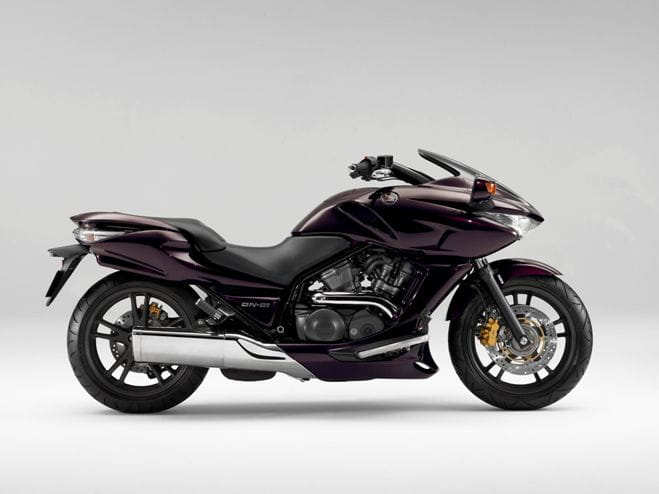
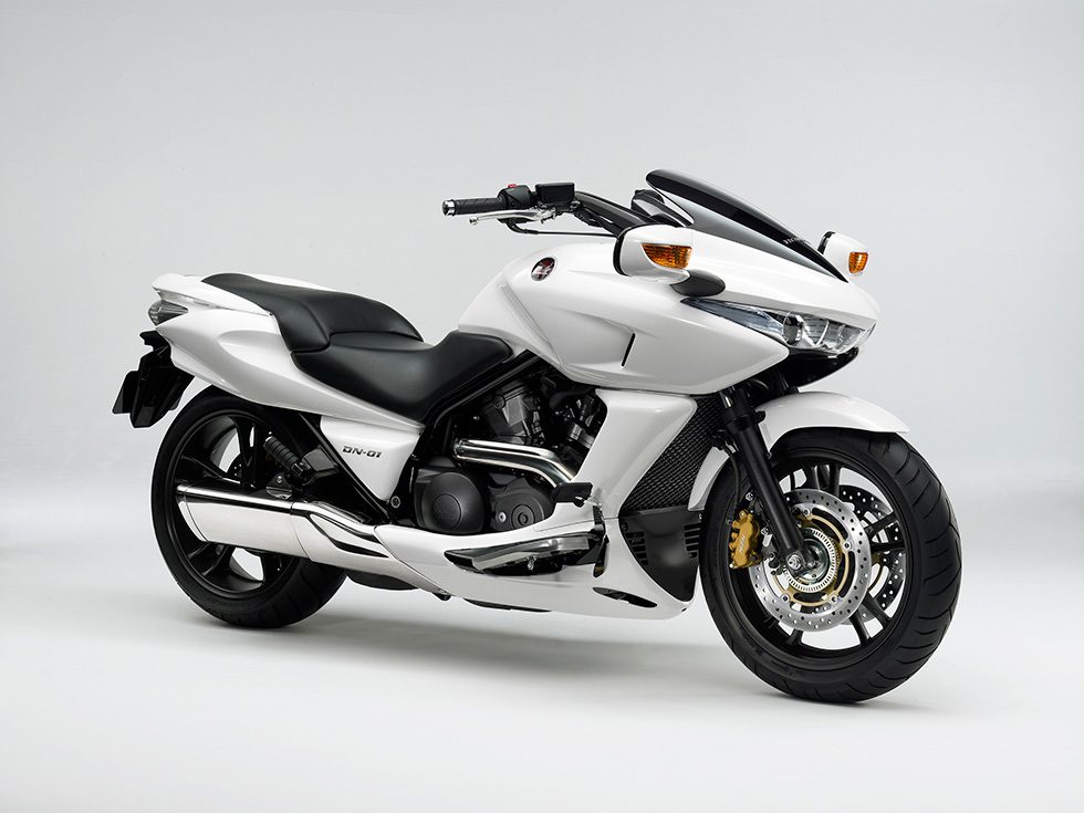
Ugliest Bikes (#4): The 2008 Honda DN-01
I’d like the killer lazer option, please. Image via Honda.
Looking like the mutant lovechild of a Japanese scooter and a fighter jet, the Honda DN-01 exploded out of the far east about as quickly as it disappeared. And while I’m all for bold design decisions, there’s a strange toy-like quality to this design that tries very hard to be cool but sadly ends up looking like a cheap plastic knick-knack from a $2 shop.
All it needs is flashing LED lights and ear splitting action movie sound effects played through a tiny speaker.
Like a police motorcycle from a Manga Movie. Image via Honda.
While I quite like the design language Honda used, I just can’t get past the ‘scooter trying to look like a space motorcycle’ vibe. Try turning up to a Sunday biker cafe and feel the shameful burn of the bikers’ gazes as they stare at you and think to themselves, ‘for the same price as that, they could have purchased a real motorcycle…’
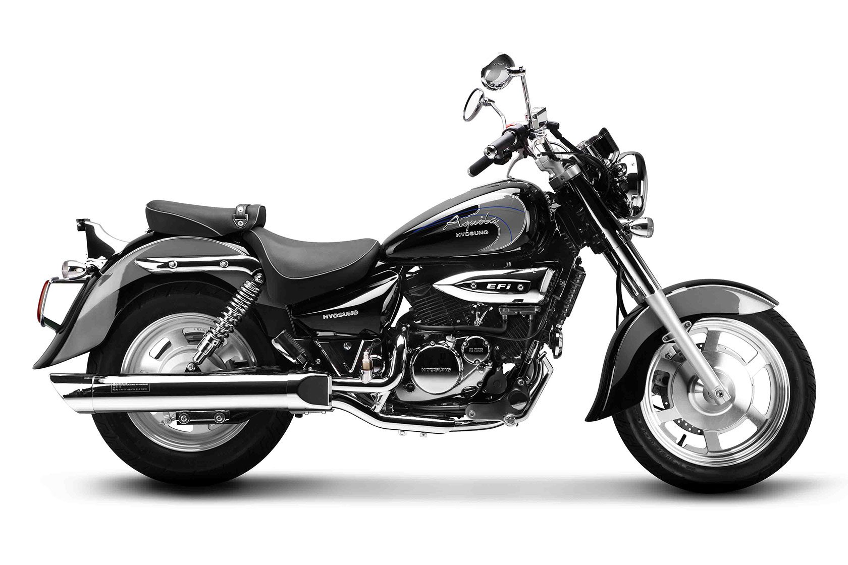
Ugliest Bikes (#3): 2010 Hyosung GV250
Tough, like a trainee accountant. Image via Hyosung.
Ever walked down a suburban street and seen those spoiled kids whose parents have bought them some exorbitantly expensive (yet still all plastic) toy vehicle that runs on 248 D-size batteries? I may be mistaken, but I’m pretty sure these toys were what inspired the poor Hyosung designers who were tasked with designing this—their ‘Aquila’ motorcycle from the Noughties.
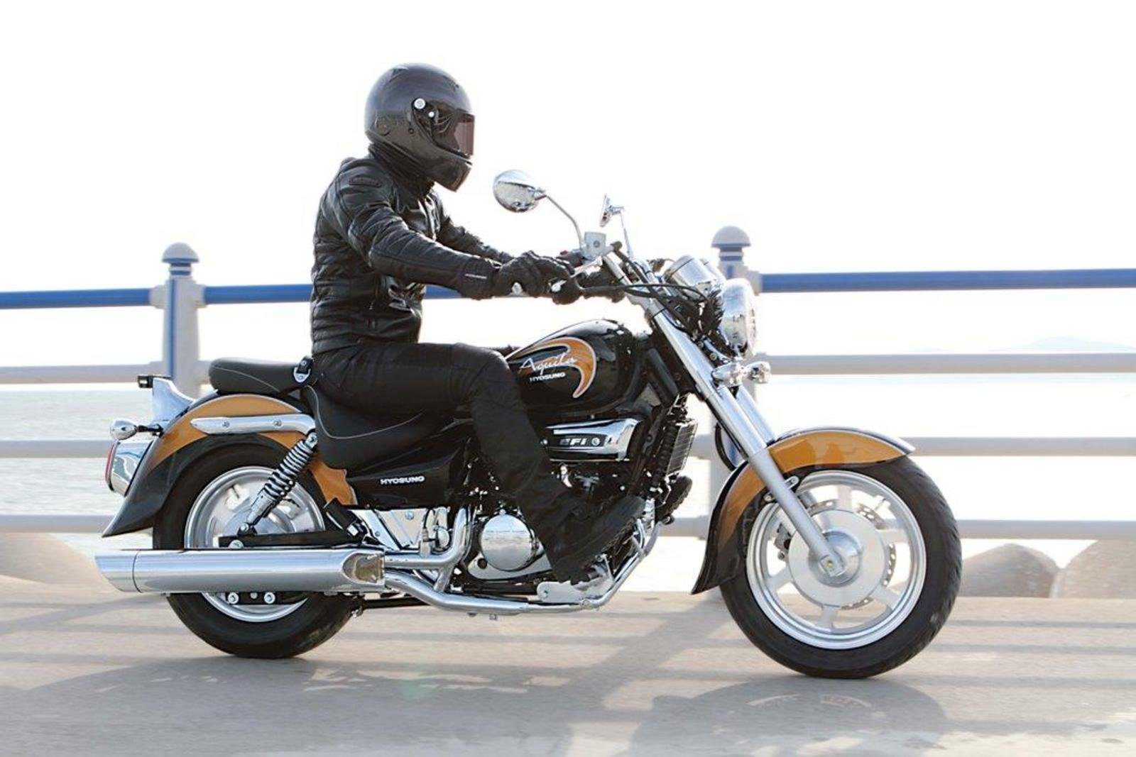
Where do the batteries go, Dad? Photo via TopSpeed.com.
Seemingly made at two thirds of its correct size, it has all the coolness of a nuclear reactor in meltdown and a violently off-trend colour scheme to match. Nothing quite says ‘I have no idea about bikes and I’m broke as well,’ like this little South Korean beauty.
While I’ll admit it’s not exactly offensive to the eyes, I still can’t quite believe how an automotive design team with half a brain between them could manage to make something as cool as a motorcycle look so damn small, vanilla and forgettable.
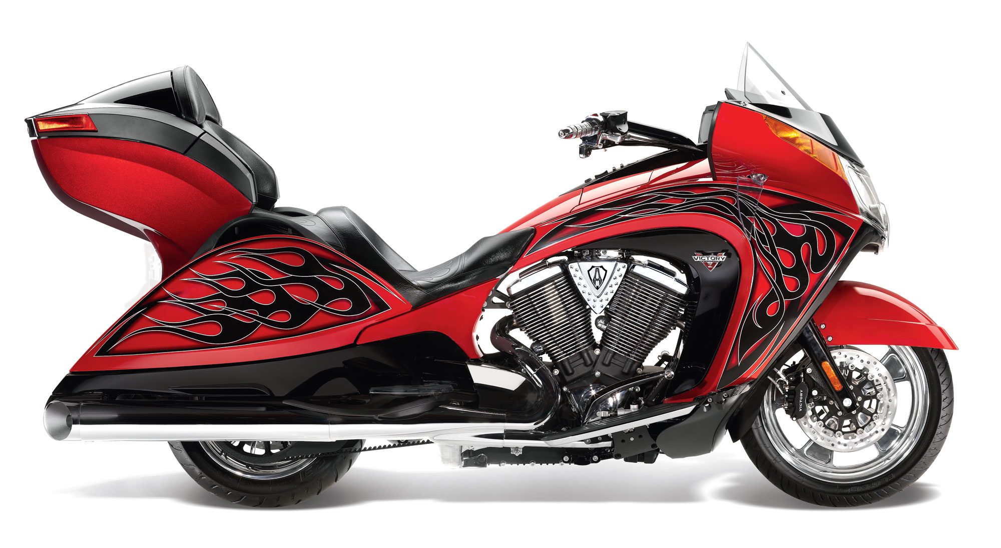
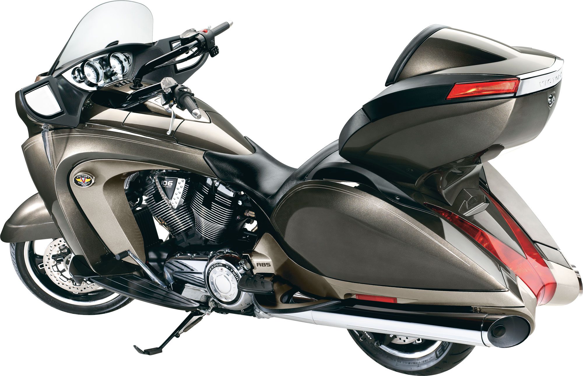
Ugliest Bikes (#2): 2007 Victory Vision
Design brief: make it look like an angry penis. Image via Victory Motorcycles.
On the flip-side of the Hyosung coin we have number 2 on our list. Talk about opposites; the Victory Vision from 2011 (shown here in its eyeball-searing Arlen Ness get-up) is a classic case of designers having way too much time and money to work with.
With all the subtlety and restraint of a drag show on acid, the end product manages to make even a hot pink ‘59 Caddy look elegant.
So heavy, it affects the tides. Image via Victory Motorcycles.
I have no doubts that arriving unannounced in the Victory design offices around this time would have revealed a wild staff orgy replete with bucking broncos, rock ‘n’ roll, beer, strippers and copious amounts of ‘sugar’ surrounding a prototype Victory Vision on a pedestal in the middle of the scene. And a hastily spray-painted sign hung from the roof using Victoria’s Secret underwear and leather tassels would have read, “BECAUSE AMERICA, BITCHES!”
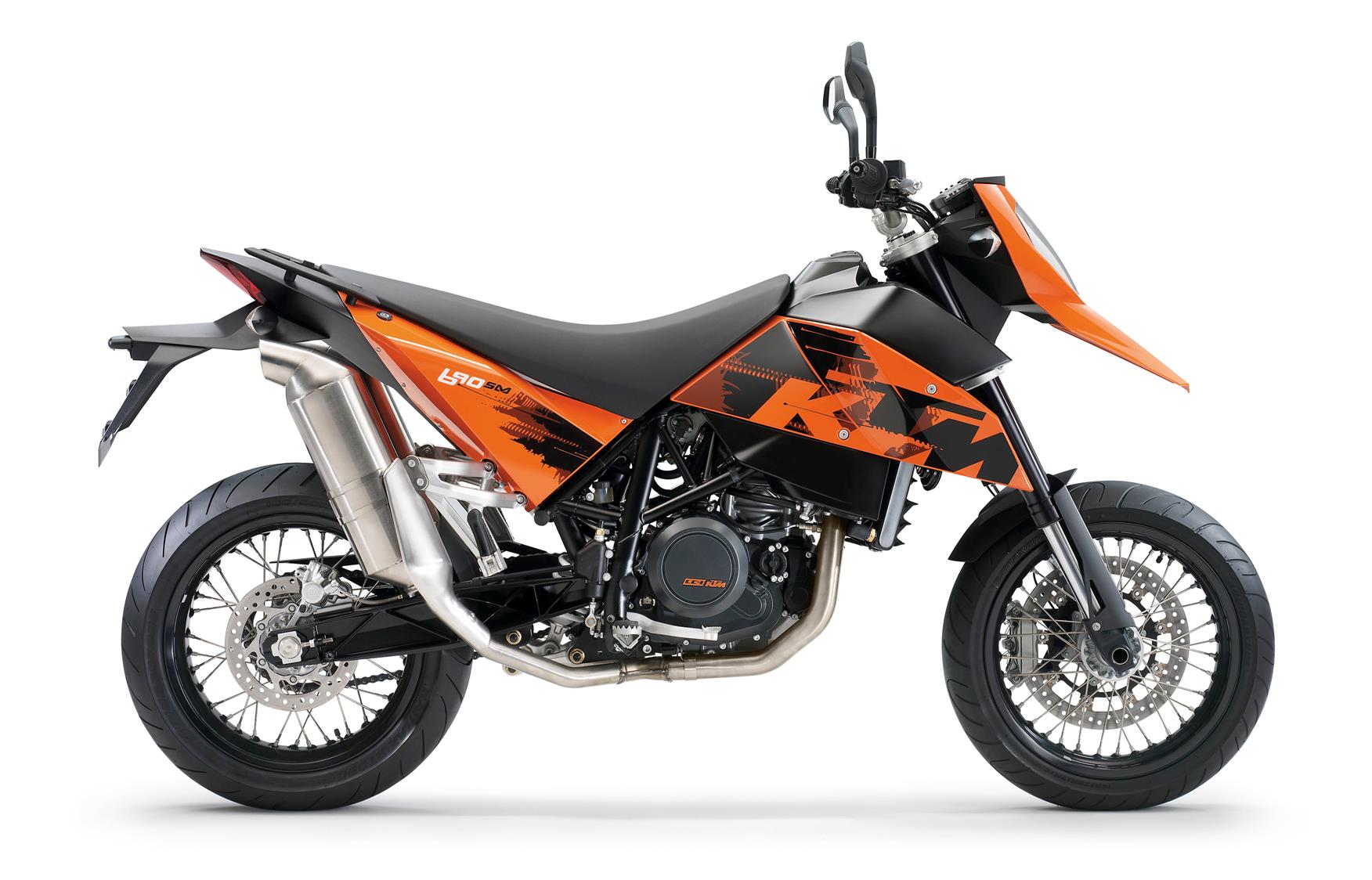
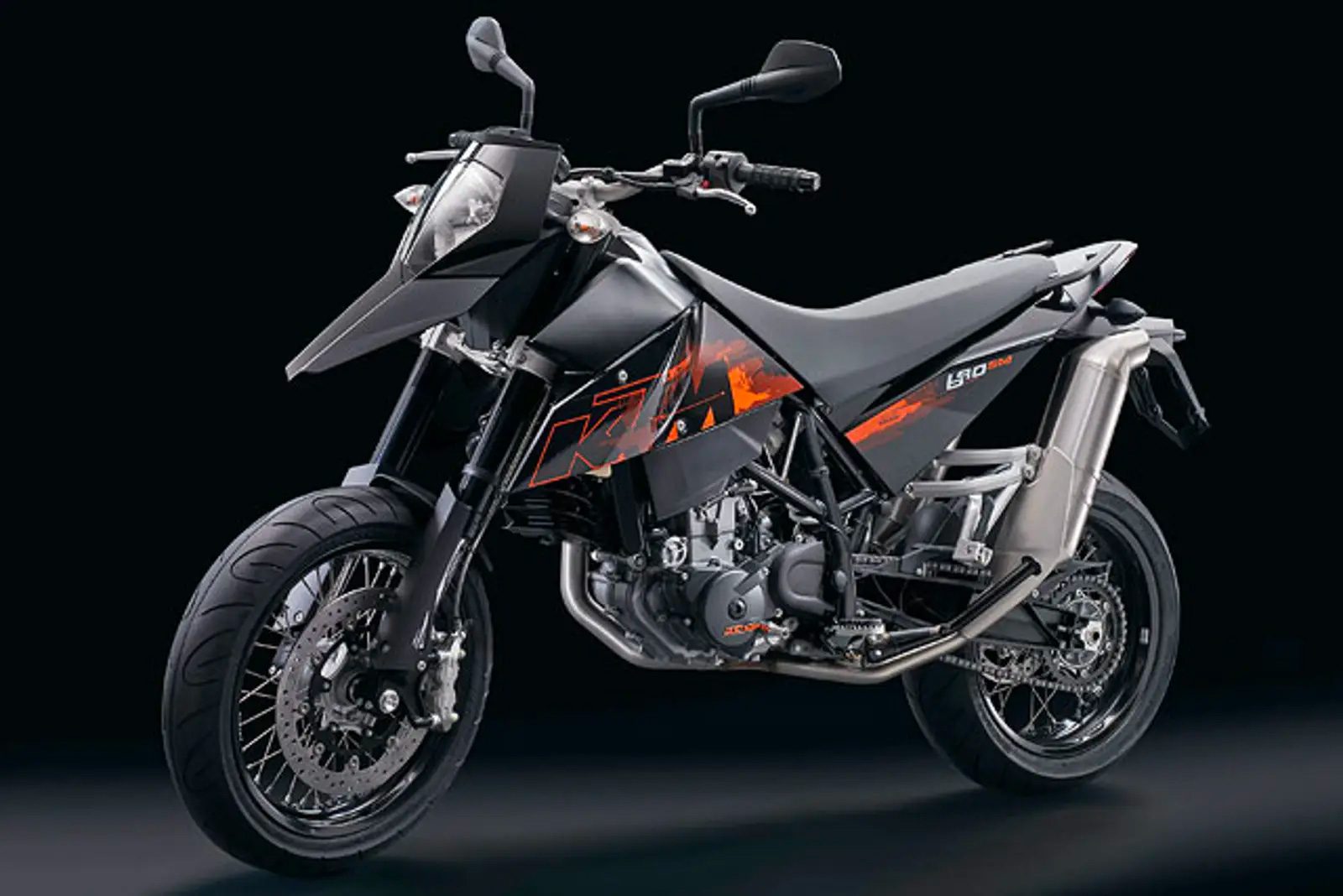
Ugliest Bikes (#1): 2007 KTM LC4 690
Like a transformer caught between changes. Photo via KTM.
With all the bikes we’ve seen so far, you’d be kidding yourself if you said that the designers had made any fundamental errors in their work. Sure, the end results were unloved bikes with some very dismal sales figures, but it’s not like any laws of nature were broken. Not until you consider the KTM lc4 690.
Working with KTM’s already very angular, aggressive design language, the studio seems to have forgotten everything they’ve ever been taught and just reverted to some kind of stone age state where sharp things and loud colours mean everything.
With it’s near vertical exhaust lines and a front fender that looks to be about half a mile too high on the bike, the entire thing reminds me of that craft exercise where kids have to make pictures out of nothing but coloured paper triangles.
On the plus side, you can always shelter under the front fender when it rains. Photo via KTM.
Yeah, yeah. I get it. It’s a ‘street motard’ so it’s got to look aggressive and edgy—but surely KTM could have achieved this without producing a bike that looks like a smashed piece of china hastily glued back together by a speed freak. I note with much relief that the design was entirely revised a few years later with the very bloody nice looking 2013 KTM 690 SMC R that really showed up the 2007 model for what it was: a hot mess.
Of course, how your bike looks is totally subjective. As they say, ‘there’s no accounting for taste’. I like chocolate, and you prefer strawberry, and that’s just the way it is. As with many things in life that deal with ego and looks, it doesn’t matter one iota at the end of the day.
If you are rocking a Victory Vision and you enjoy it, then that’s what really matters. Because letting internet strangers like me tell you what’s cool and what isn’t is just a little bit silly, don’t you think?


