New Graphics Keep the Corsair Looking Fresh
Arai recently announced a new set of graphics for its popular Corsair-X full-face helmet. The Corsair-X is one of the best helmets out there, but it has been out for a while now and Arai has to keep it looking fresh. Its most recent effort to do so consists of two new graphics each with a few different colors.
Both of the new graphics provide the helmet with a unique look, but the Dani Samurai-2 Blue is the most eye-catching. It wouldn’t be my first choice (I prefer solid colored helmets), but even I can’t deny that it made me take a second look. The Bracket graphic is attractive, but the Dani Samurai-2 is the one to get the most excited about.
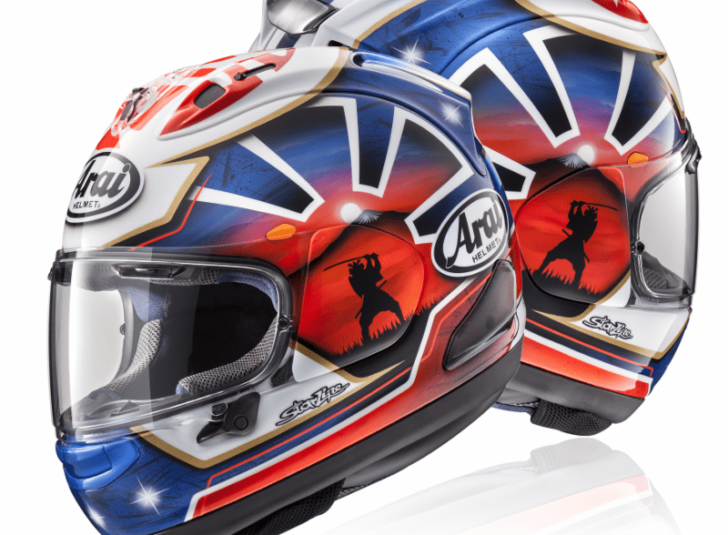
Corsair-X Dani Samurai-2
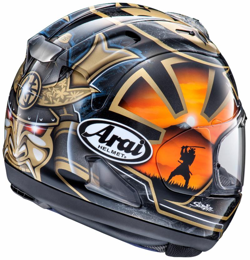
The Dani Samurai-2 is a graphic with a lot going on. At the center of the design on either side of the helmet is a samurai figure. The Arai badge displays prominently on either side and the front of the helmet. On the rear is another samurai design with the word “Dani.”
As I said, this wouldn’t be my first choice, but I can see a lot of sportbike riders liking the style. There’s a lot going on and the more you look at the graphic the more little things you notice. Arai offers it in two different color schemes. One the company calls Blue (shown in the video above), which uses blue, white, red, and black to craft the graphic.
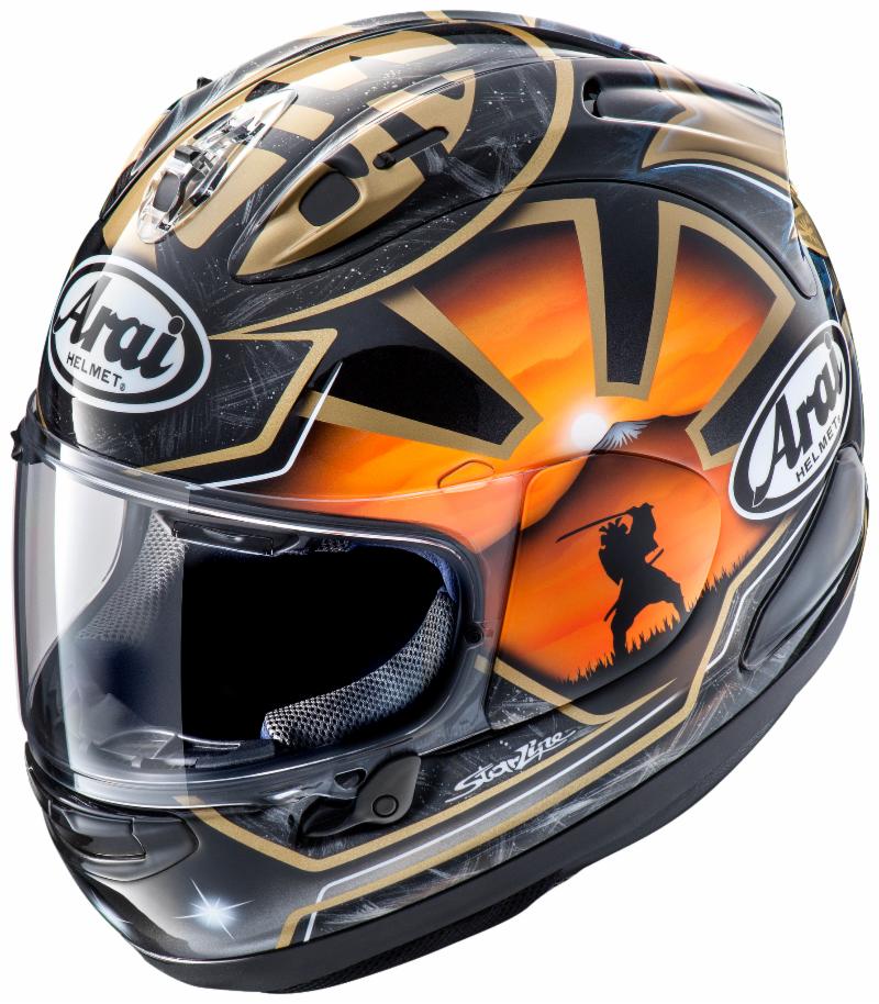
Arai calls the other color scheme Black, and it uses black, gray, gold, and subtle hints of blue in the design. The details of the design are also a little different, with the most notable change being the samurai mask at the back of the helmet.
Corsair-X Bracket
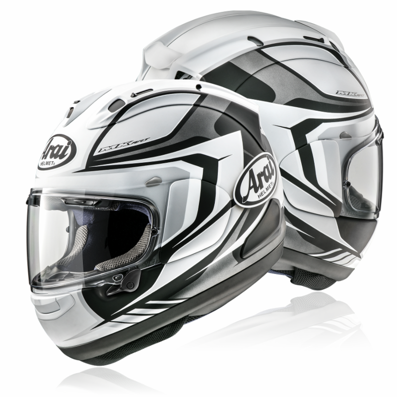
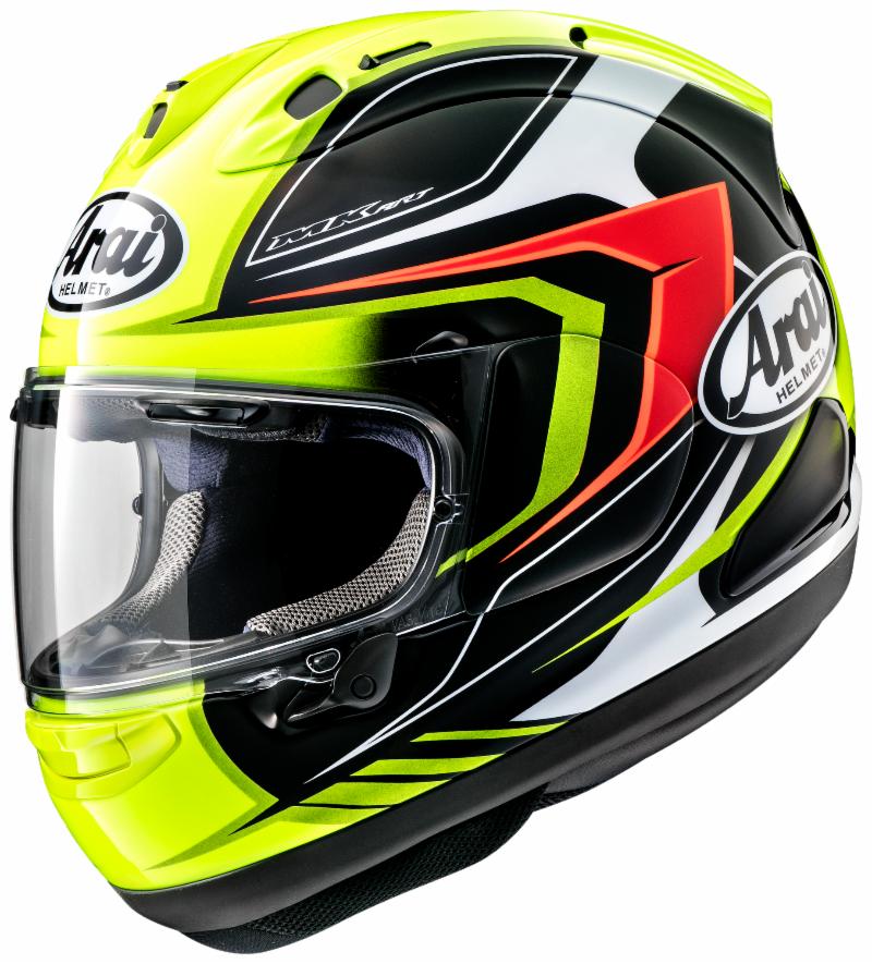
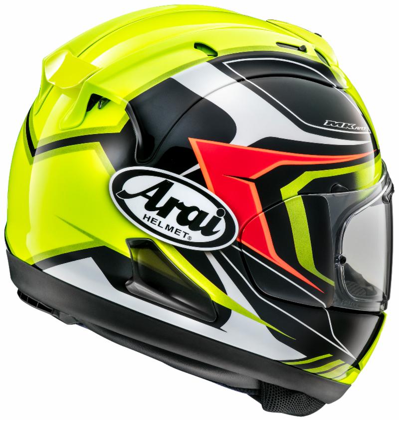
The other new graphic is the Bracket. It uses sharp angles and a mix of curved and straight lines to give the Corsair-X a new look. It’s not quite as complex as the Dani Samurai-2, but it’s an offering I could see more people liking.
Not everyone is going to like the whole samurai thing on the other graphic, but the Bracket one is just more of an aggressive, sporty looking design. Arai offers three different color schemes for the Bracket graphic: White Frost, Black Frost, and Fluorescent Yellow.
White Frost uses white as the primary color accented with black and gray to make up the design of the Bracket graphic and give the helmet an interesting look.
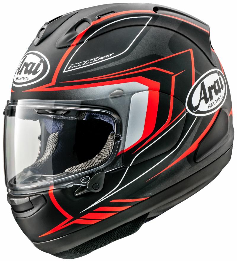


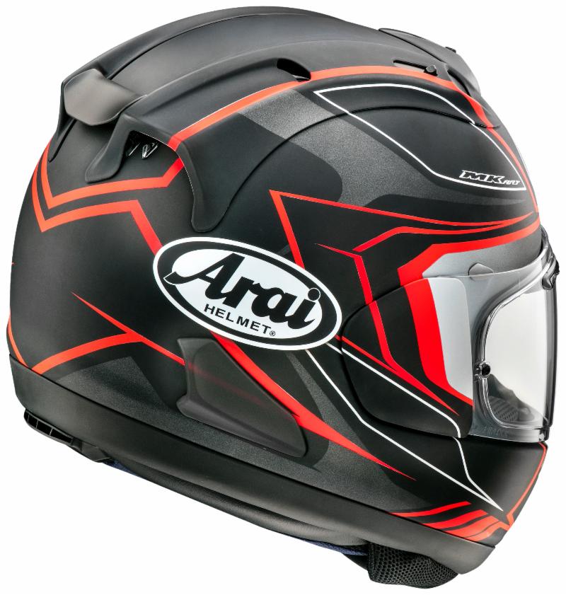
You’d think Black Frost would be the opposite of White Frost with its colors simply flipped, but instead, Arai used black as the base and used red and a light grayish white to complete the design.


Fluorescent Yellow is the color scheme to get if you truly want to stand out on the road. The design uses red, black, and—you guessed it—florescent yellow to make the most interesting of the Bracket graphics. The color combo adds a depth to the design that the others simply don’t have.
